


The BL[OZ]

AI, Sugar, and Side Effects
By
Dorin Peleg
, 30/03/2026
AI isn't a magic fix; it’s an endless candy store where it’s easy to get lost in the noise. Discover why a surplus of tools makes selection your biggest strategic challenge, and how to shift from chasing "the next shiny thing" to a purposeful process that puts business goals before technology.
Why More Tools Don’t Always Help
The problem with abundance isn’t the technology itself-it’s understanding what we’re actually trying to solve. Every tool can look appealing. It can offer automated writing, visual creation, smart diagrams, marketing content, advanced research, and more. But without a clear process, it all becomes noise. Like a child in a candy store who can only choose two candies before checkout, we need selection tools-not just solution tools.
How to Get It Right (Without a Sugar Overdose)
When we work with B2B brands, we always come back to a simple question: What do our customers really need? And what is our business goal? Once the goal is clear, the abundance of tools stops being overwhelming. It becomes a repertoire of solutions tailored to what’s needed—instead of what’s possible.- The key is: Define the need, not the tool
- Before choosing an AI tool, start with the question: What outcome am I trying to achieve? What does success look like?
- Build a decision framework Don’t let every shiny new idea set the pace. Create a structured set of questions and criteria that connect to real KPIs.
- Don’t lose the human context AI is the result of human creativity-not the answer itself.

So What Does Choice Look Like in Practice?
If we go back to the candy store-not every candy fits every moment. The same goes for AI. There are great tools for every task, but the choice doesn’t start with the tool’s name—it starts with the need. For example: When I need to generate text, I usually work with ChatGPT or Gemini. Both are fast and powerful, but the choice depends on tone, precision, and the outcome I’m aiming for. When it comes to visuals-surprisingly-ChatGPT delivers great results as well. Gemini (especially Nano Banana) excels when combining existing products, and in other cases, I like working with Midjourney or Artlist-each offering a slightly different level of control and style. For animation, I often use Freepick and Gemini-especially when I need fast solutions without fully compromising on quality. For voiceovers, ElevenLabs is almost always my go-to, delivering results that sound more natural and accurate for most use cases. And for music, while you can generate it with Suno, if you’re not a professional musician, it’s often more efficient to use platforms like Freepik, which now offer a solid and user-friendly music feature. In practice, we almost never rely on a single tool. The real choice is always a combination-between multiple tools, and between those tools and human thinking that connects them. So the real question isn’t “Which tool is the best?” It’s “Which combination of tools serves the goal most effectively?”What Actually Makes It Work
Earlier, I mentioned a confused child in a candy store. But the one who really knows how to choose isn’t the child-it’s someone with experience, knowledge, and an understanding of what to look for. Behind every valuable AI tool are people: developers, researchers, creators, designers-those who know how to connect technology to real business needs. They’re the ones who give these tools meaning. Without human intention, context, and strategy-even the most advanced tools won’t lead to real results. AI is not magic. It’s the outcome of accumulated human creativity.The Real Choice
In an age of abundance, the advantage isn’t the newest AI tool. The advantage lies in the ability to:- Choose wisely
- Execute with understanding
- Stay focused on clear, business-driven goals

Animations In The World Of Ai
By
Eliav Yosef
, 23/03/2026
AI didn’t make motion design easier—it made it more strategic. Discover how the world of animations is shifting from manual execution to high-level direction, and why the human element is now your brand's most critical asset.
Animations have been changed forever by AI — but not in the way many people first imagined. If you're a B2B marketing leader, you might assume AI-driven animations are simply a cheaper, faster way to churn out content. But this isn’t a story about replacing motion designers or animators; it’s a story about redefining the craft, reshaping workflows, and clarifying where human creativity and brand strategy in animations become more important than ever.
In 2026, creating animations with AI is not about pressing a button. It’s about directing systems, shaping narrative, and knowing where automation ends and design begins. More importantly, it is a tool that allows complex B2B brands to visualize abstract technologies through high-quality animations faster and more effectively before committing to a final, expensive 3D render.
Here is a look at the modern AI ecosystem for animations, how the workflow has evolved, and why the human element remains your brand's biggest asset.

The AI Animation Toolbox: What’s Actually Being Used
AI animation is not powered by one “magic tool,” but by ecosystems of platforms, each serving a different creative role.- Cinematic AI Video Generation: Tools like Higgsfield focus on video as cinema, not as motion graphics. They allow creators to define camera movement, pacing, and visual language using prompts that resemble directing notes more than animation instructions. These are ideal for short cinematic sequences and concept films with strong mood and intent.
- Workflow & Creative Orchestration: Freepik Spaces, Weavy, ComfyUi or any node-based AI platform represents a new category: AI as a workflow environment. Instead of jumping between disconnected tools, designers can build idea-to-video flows, experiment visually, and treat animation as a system rather than a single file. This is especially powerful for B2B studios managing complex creative pipelines.
- Experimental Ideation & Visual Exploration: Platforms like Google Labs are less about production, and more about creative exploration. They help designers rapidly test visual directions and build moodboards to explore aesthetics before animation begins.
From 2D to 3D: AI-Driven Dimensional Thinking
One of the most impactful shifts in AI animation is the ability to move from flat images to spatial scenes. Modern AI engines can infer depth from a single image, generate basic 3D structures from 2D visuals, and enable camera movement inside static compositions. For B2B brands selling complex hardware or medical devices, this is revolutionary. It allows motion designers to start with intuition and sketches, and only later move into structured 3D workflows—reversing the traditional, time-heavy pipeline.
The Right AI Animation Workflow (Step by Step)
AI doesn’t eliminate process—it demands a better one.- Concept & Narrative Definition Before touching any tool, you must ask: What is the story? Is this cinematic, playful, abstract, or informative? AI performs best when creative intent is crystal clear.
- Visual Language & Mood Exploration This is where AI shines. Designers can rapidly generate visual styles, test lighting, and explore pacing. At this stage, speed matters more than precision.
- AI-Generated Motion & Video Using video diffusion engines, creators generate motion drafts and experiment with rhythm and transitions. Think of these as rough cuts, not final films.
- Human Refinement & Direction (The Brand Check) This is the most critical step, and the one AI cannot replace. This is where designers shape timing, ensure narrative clarity, and fix inconsistencies AI inevitably introduces. Most importantly, this is where the visuals are strictly aligned with your brand guidelines. B2B brands need exact hex codes, corporate typography, and regulatory compliance—nuances AI simply cannot manage alone.

What AI Enables vs. Where Professionals Are Essential
The Democratization of Ideation: AI enables anyone to generate basic animated visuals, create short experimental videos, and prototype ideas without technical expertise. This democratization is powerful — and positive. Where AI Alone Falls Short: However, when it comes to high-stakes B2B marketing, "almost right" isn't good enough. AI struggles with:- Strategic storytelling and complex narrative structures
- Strict brand consistency
- Emotional nuance and long-form animation logic
The New Role of the Animator
In the AI era, motion designers and animators are no longer just executors of movement. They have evolved into visual directors, narrative architects, and AI system orchestrators. They act as the vital translators between brand, story, and technology. AI handles generation. Designers handle meaning.Final Thought: AI Doesn’t Replace Motion Design, It Raises the Bar
Animation has always been about movement. But today, it’s about intentional motion. The designers and marketing teams who thrive in this era won’t be the ones who master every new software update. They will be the ones who know when to use AI, when to override it, and when human judgment is the difference between digital noise and a compelling brand story. AI didn’t make motion design easier. It made it more important.
The Jewish Lion: How to Build a Brand That Lasts 3,000 Years
By
Amit Sakal
, 04/03/2026
Beyond ancient symbols: How do you build a brand that lasts for millennia? Discover the fascinating branding strategy behind the Jewish Lion – from the Bible to the modern battlefield.
How do you build a brand that lasts for millennia? If you are wondering how to build a brand that lasts for generations, the answer lies in one ancient symbol.Lately, certain names have resurfaced: “Am KeLavi” - A People Like a Lion. “Roaring Lion.”
Operation names. Security language. Headlines. But from a branding perspective, this is a fascinating choice. In an era when nations invest billions in narrative, public diplomacy, and perception management, Israel repeatedly returns to the same ancient symbol: the lion. Not a refreshed logo. Not an updated digital aesthetic. Not a passing graphic trend. A lion. And when you examine it closely, it may be one of the most consistent branding moves in human history.
A Brand That Hasn’t Rebranded Since Genesis
The story begins long before content strategy or visual systems. In the Book of Genesis, Jacob blesses Judah with the words: “Gur Aryeh Yehuda” - Judah is a lion’s cub. This wasn’t merely poetic imagery. It was a foundational positioning decision. The lion wasn’t chosen because it is the strongest animal in the wild. It was chosen because it is perceived as sovereign - a natural authority, a presence that does not need to strive for dominance. In branding terms, this is precise positioning. The lion does not symbolize reckless aggression. It represents restrained power. Not “we attack.” But “we are here - and we are not going anywhere.” That is a far deeper message than brute force.
Design in Exile: When There Is No State, There Is Still a Visual Language
For nearly two thousand years, there was no sovereignty. But there was branding. The lion appeared in synagogues, on Torah arks, in manuscripts - often flanking the Tablets of the Covenant, sometimes crowned. From a design perspective, this was brilliant: When political power disappears, you reinforce the symbol. During exile, the lion was not a call to rebellion. It was an anchor of identity. A form of brand consistency in the midst of historical chaos. Real brands are not built in comfortable eras. They are tested in difficult ones.
Zionism: Rebranding Without Losing the DNA
When modern Zionism emerged, it did not invent a new emblem. There was no dramatic visual overhaul. The lion simply shifted tone. Less mystical - more national. Less decorative - more upright. Less memory - more action. This was not a rebrand. It was a tonal update. One of the most powerful visual moments in Israeli cultural history is the “Roaring Lion” monument at Tel Hai. Not a victorious lion. Not a charging lion. A wounded lion - roaring. That is a courageous branding decision. It does not sell “absolute power.” It sells endurance. Resolve. Cost. A brand built on courage through standing firm lasts longer than one built on dominance alone.
The IDF: A Language of Consciousness, Not Just Operations
When military operations are named “Am KeLavi” or “Roaring Lion,” this is not biblical romanticism. It is narrative strategy. Operation names are never merely technical labels. They are messages. Inward - to soldiers and society. Outward - to adversaries and to the world. The lion enables Israel to position itself as restrained yet determined. Not a wild force. Not an imperial aggressor. But an actor capable of patience - and action. The distinction is subtle. And critical.
Why It Still Works
Because the lion carries rare historical depth. It bridges scripture and sovereignty. An ancient verse and a modern fighter jet. Memory and statehood. In a world where brands redesign their logos every five years, the Jewish lion is proof that true brand equity is built across generations. Not through trends. Through consistency.
What Can Branding Professionals Learn From This?
- A strong symbol doesn’t need to shout constantly.
- Deep brands are anchored in story, not aesthetics alone.
- Long-term consistency outperforms cosmetic refreshes.
- Restrained power is a strategy - not a weakness.

The Secret to a Winning Dish: Building a B2B Presentation That Drives Results
By
Efrat Hemsi
, 02/03/2026
A B2B presentation isn't just a slide deck; it's a strategic business asset. Learn why crafting a presentation is like preparing a gourmet meal, and why strategy must always come before design to seal the deal.

Strategy first. Design second.
One of the most common mistakes I see is jumping straight into design. Colors, icons, layouts, before anyone stops to ask the questions that actually affect outcomes:- Who is the audience?
- What action do we want to happen at the end of this presentation?
- What is the one message every slide must deliver?

Simplicity wins. Story connects.
Especially in complex B2B environments, simplicity is a real competitive advantage.- One slide = one idea
- Less content = more clarity
- A strong story = decisions happen
Presentations that generate real business results
A good presentation doesn’t just look good. It works for the business.- Drives sales by translating complexity into clear value
- Attracts investors by building credibility and highlighting potential
- Accelerates onboarding by helping teams quickly understand what matters
- Strengthens the brand by projecting professionalism and consistency

A presentation is a business tool, not a graphic file
A presentation keeps working even when you’re not in the room.- It gets passed along to decision makers you never meet
- It creates an internal narrative inside the organization
- It reinforces the brand over time
Turning presentations into a growth engine
A presentation becomes a strategic asset when it:- Connects the audience to the solution, not just the company
- Communicates value clearly, even in complex industries
- Supports the customer throughout the decision journey
- Maintains brand consistency at every touchpoint

So before serving the dish, a quick recap:
- Start with strategy, not visuals
- Simplicity and a strong story beat overload
- Measure presentations by outcomes, not aesthetics
- It’s a business tool, not a design file

Marketing in China: Not Just Another Market- A World of Its Own!
By
Sivan Barkay Menachem
, 10/02/2026
China isn’t just another market—it’s a parallel universe with its own rules for AI, social media, and visual language that every global brand must learn.

Color, Visual Language, and Regulation: More Than Aesthetic Choices
In China, color is not a matter of taste, it is a language. Colors carry deep cultural, symbolic, and sometimes political meaning, and incorrect use can confuse audiences, weaken trust, or even lead to content being restricted. For example:- Red is associated with luck, success, and celebration. It is widely used, but poor balance can feel loud or low-end.
- White is strongly linked to mourning and loss, making it problematic as a dominant color in celebratory or brand-driven contexts.
- Black conveys formality and authority, but in certain contexts can feel distant or somber.
- Certain color combinations, symbols, icons, or visual metaphors may be culturally or politically sensitive, even if they are considered neutral in Western markets.
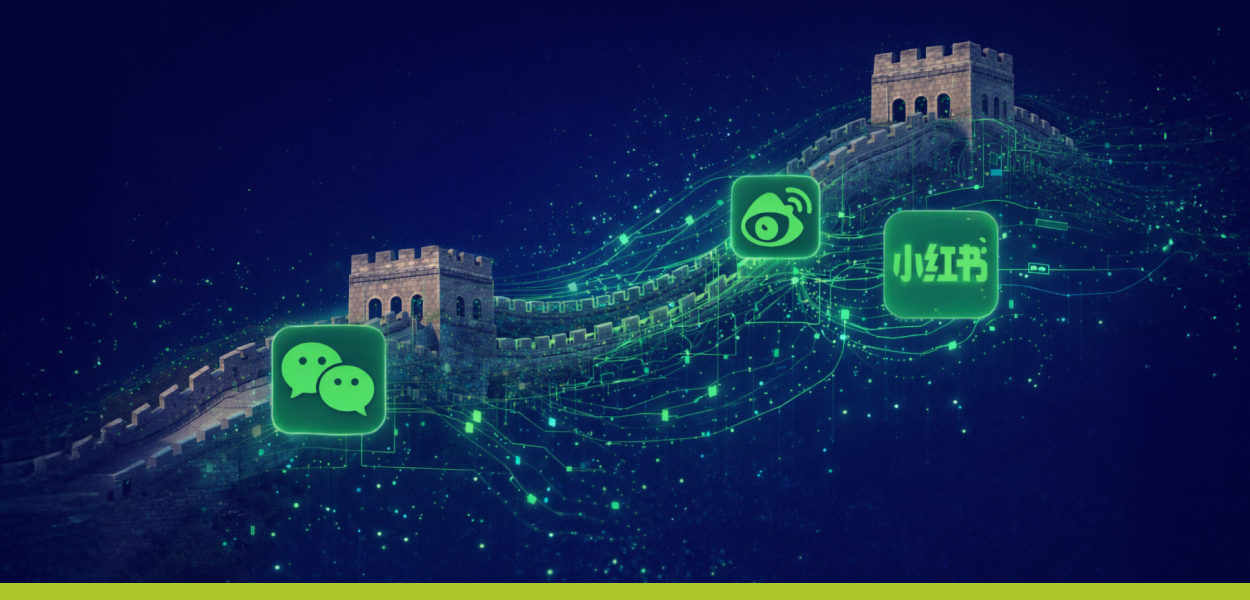
Social Media: Same Goals, Completely Different Ecosystem
China does not use Facebook, Instagram, LinkedIn, or X. Instead, it operates within its own ecosystem of platforms such as WeChat, Weibo, Rednote, Douyin, and others, each of which functions far beyond what Western audiences think of as “social media.” WeChat, for example, combines content, community, CRM, customer service, payments, and commerce in one tightly integrated environment. As a result, effective marketing in China, particularly on WeChat, goes beyond reach or engagement and focuses on building long-term relationships within a closed, all-in-one platform.Search Engines: Google Is Not Part of the Equation
Google is largely irrelevant in China. Search behavior is driven primarily by Baidu and other local engines, each with different algorithms, SEO rules, and content expectations. Simply translating a website or blog into Chinese is not enough. Effective visibility requires content structure, hierarchy, and language that align with how Chinese users search for and evaluate information.
Chinese AI: A Parallel Universe, not a Local Version
Artificial intelligence in China also operates in a parallel ecosystem. Many Western AI tools are restricted or unavailable, replaced by local models such as ERNIE, Qwen, Doubao, and others. The differences are not only technical, but conceptual:- These models are trained on different datasets, in different cultural and regulatory contexts.
- Clear limitations exist on topics, phrasing, and types of content.
- AI is often embedded directly into Chinese platforms rather than offered as open, standalone tools – especially in Baidu’s case.

Local Partnerships as a Strategic Advantage
Marketing in China is extremely difficult to manage remotely. Language, regulation, culture, platform behavior, and business norms require deep, on-the-ground understanding. This is where local expertise becomes essential. We have worked for many years with Brandigo, and have seen firsthand their deep expertise in B2B marketing within the Chinese market- from strategic positioning and message localization to smart use of local platforms and cultural nuance. Strong local partners bridge the gap between Western brands and Chinese audiences without sacrificing credibility.The Bottom Line
China is not “just another large market.” It is a self-contained system with its own rules, pace, and internal logic. Succeeding there requires humility, learning, true localization, and the right partners. We are not experts in Chinese marketing, but we know when expertise is required. And in a market like China, that distinction makes all the difference.Want to dive deeper into B2B marketing in China?
We highly recommend exploring the Brandigo blog, where they share in-depth insights, practical experience, and up-to-date perspectives on navigating the Chinese B2B market- https://www.brandigochina.com/blog
B2B Design & Tech Trends 2026: From Visual Appeal to Strategic Experience
By
Amit Sakal
, 12/01/2026
In 2026, B2B design is more than just a modern look—it’s a strategic engine for clarity. Discover the six key shifts, from Hybrid Intelligence to Vibe Code, that help users understand complex products and drive faster decisions.

Multi-Sensory Experiences & Hybrid Intelligence When design is felt, not just seen
2026 marks a clear shift from purely visual design to multi-sensory digital experiences. After years of screen fatigue, users crave interfaces that feel richer, more immersive, and more human. Even in digital environments, design now aims to evoke sensations associated with touch, depth, motion, and materiality. This is where Hybrid Intelligence: the collaboration between AI and human creativity becomes a powerful driver. AI is deeply embedded into the creative workflow:- Generating visual directions and variations
- Exploring textures, motion, and spatial depth
- Accelerating experimentation and ideation
- Soft, tactile, and inflated textures
- Hyper-realistic objects combined with playful distortions
- Subtle motion that suggests weight, resistance, and flow
- Interfaces that feel immersive rather than flat

Glassmorphism, Evolved Transparency as a system, not a decoration
Glassmorphism continues into 2026 - but in a more mature and intentional form. What once appeared as a visual trend is now becoming a functional design system used to manage hierarchy, density, and focus. In B2B interfaces especially, where dashboards, data layers, and dense content are common, glass-like surfaces help:- Separate layers without heavy borders
- Maintain context while guiding attention
- Create depth without visual noise

Vibe Code & Self-Serve UX Design that explains before sales ever enter the room
Modern B2B buyers don’t want to be sold to first - they want to understand. In 2026, the most effective B2B experiences are built around self-serve exploration:- Interactive demos
- Calculators and simulators
- Product explorers and configurators
- Guided journeys that adapt to user intent
- Answering questions before they are asked
- Allowing users to test scenarios on their own
- Building confidence before human interaction

White, Minimalism & Visual Calm Less noise, more authority
White and near-white palettes dominate B2B design in 2026, not as an aesthetic trend, but as a strategic choice. Minimalist layouts, generous spacing, and visual restraint are essential when:- Products are complex
- Messages need credibility
- Decisions carry high business impact

Dynamic Personalization at Scale One interface, many audiences
B2B audiences are rarely uniform. Different roles, industries, regions, and levels of expertise require different messaging and in 2026, design finally reflects that reality. Interfaces are becoming more adaptive:- Content shifts based on industry or role
- Messaging adjusts to user behavior or entry point
- Visual emphasis changes according to intent

Design as a System, Not a Page Modular, scalable, and built for growth
In 2026, strong B2B design is rarely page-based. It’s system-based. Design systems evolve to support:- Rapid scaling across products and markets
- Consistency across platforms and touchpoints
- Faster iteration without breaking brand integrity
Closing Thought
Design in 2026 is not about trends for the sake of trends. It’s about using design to reduce complexity, build trust, and create meaningful experiences in an increasingly technical world. For B2B brands, the opportunity is clear: Those who treat design as a strategic layer - not a visual afterthought — will lead the conversation, not follow it.
Why not build your own tools? It’s Easier Than You Think
By
Nevo Levin
, 29/12/2025
AI can generate code in seconds, but building an internal tool that fits your exact workflow is where the real value lies.
What if I told you that the internal tools you use today don’t have to come from a plugin, an off-the-shelf system, or a solution that doesn’t quite fit?
And what if the most precise tools for your workflow are the ones that don’t even exist yet—until you build them?
In recent years, something profound has been happening quietly. Internal tools—those that once required developers, endless work hours, and a significant budget—have suddenly become accessible to everyone. AI is not just changing the way we work; it’s changing who can build the tools we work with.
Systems that used to be massive projects can now be built within hours. The person writing the brief can become the one creating the solution. Internal tools no longer have to be bought off-the-shelf or from an external vendor. They can be born out of a daily process, a recognized need, and a deep understanding of how we actually work.
This is exactly what happened with us. Time and again, we discovered that a certain process was stalling us, that communication was dragging, or that a small action was turning into a major task. So, instead of searching for a plugin that "sort of" fits, we built tools that were precise for us: a task-sharing system for clients, an email signature generator based on an existing design, custom forms, and finally, a QA tool that grew from a small idea into a system that works on any website.

When the Process Needs a Tool, Not Another Meeting
In most projects, the problem isn’t the people or the understanding. The problem is the tools—or more accurately, the lack thereof.
We learned long ago that the solution to ambiguity isn't another meeting or another document. Sometimes, all you need is a small tool that organizes reality right where the process gets stuck.
That’s how we started building our own internal tools with AI.
No heavy systems, no generic plugins; just solutions born from our real needs and those of our clients. Just as we build websites for our clients, we began designing our own internal work processes.
During the past year, we created several internal tools using AI, including:
-
A task sharing and tracking system between clients and the team.
-
An email signature generator that creates a customized version for every user.
-
Interactive forms for various clients as needed.
-
A visual QA system that operates directly on the website.
-
A smart system for creating digital business cards.
Every one of these tools was born from the same point: a small pain point that grew. AI made the development of these solutions simple, fast, and accessible.
This is perhaps the greatest AI revolution. It allows businesses like ours to build internal tools that were previously reserved for corporate giants. Today, you can create a precise solution the moment it's required, instead of adapting to what already exists.
How a Small Idea Became a Plugin That Works on Any Site
It all started with a pain point familiar to every digital team: scattered comments, long review cycles, endless question marks, and conversations that lead to no clear conclusion. So, we built a tool.
We opened ChatGPT and described the experience we wanted, rather than the code. From there, we began to refine and improve.
Within days, a QA plugin was born that felt like working inside Figma, only it takes place on the live website. No documents, no infinite calls, and no guessing. Just pins on the screen and comments appearing exactly where they need to be.

See How Simple It Is
When the QA layer is activated, the website becomes a workspace.
A click adds a pin. A pin opens a card. A card allows you to write a comment, add a small image, mark a status, or have a brief chat between team members.
No files, no links, no mess.
To keep things organized, there is also a side panel that aggregates all comments. You can filter by status, toggle between colors, jump to a specific point, and see thumbnails that provide context.
Everything is clear and easy to understand. That’s the beauty of it: a good tool doesn’t have to be heavy. It has to be precise.
The Future of Internal Tools Starts Here
The most significant takeaway isn't necessarily the plugin itself, but the new approach.
AI allows every business to build precise internal tools tailored to how they actually work.
No heavy systems, no forced adaptations, and no long development processes.
Instead of adapting ourselves to existing tools, we are starting to design the tools around us. Processes that were cumbersome become simple. Communication that was once overloaded becomes direct. And what used to be "that's just how it is" becomes "this is how we decided it should be."
It’s not just a matter of efficiency; it’s independence. The ability to build tools in real-time, without waiting and without external dependencies.
AI opens a new possibility where every small idea can become a real tool that advances the company, strengthens processes, and allows us to work smarter every single day.

Synthetic Humans and Brand Stories
By
Yoav Sondak
, 25/12/2025
AI can create faces in seconds, but trust, character, and good storytelling still take human judgment.
Synthetic humans are quickly becoming the newest wildcard in the marketing world. They promise instant faces, infinite diversity, zero scheduling conflicts, and a level of visual flexibility that traditional photoshoots could never match. At the same time, they introduce new questions about realism, accuracy, and what it truly means to build trust through images. The result is a strange mix of creative freedom and creative chaos, efficiency and unpredictability, impressive breakthroughs and very real failures. In other words, exactly the kind of shift that forces brands and designers to rethink how they tell visual stories.
If you work with visuals, you cannot ignore this technology. And if you use it, you need to understand both its possibilities and its pitfalls. Here is what synthetic humans actually make easier, what they complicate, and how smart teams are learning to use them without losing their focus or their brand integrity.
What AI really makes easier in client visuals Let us start with the fun part. AI lets us create very specific personas in minutes. If a campaign needs a clinic nurse in her early 40s with a calm presence and warm eyes, an irrigation engineer with sun-tanned skin and slightly dusty trousers, or a farmer in his fields who looks like he actually knows how to repair a dripline by hand, we can dial that in. No casting, no schedules, no “our best model canceled at the last minute” drama. It also helps when we need groups that stock libraries do not always represent well. A mixed team of engineers with balanced ethnic diversity. A group of middle-aged professionals for a B2B product. A family that does not look like a toothpaste commercial from 1992. AI gives us a bigger playground and fewer excuses. And yes, budget wise it saves time. Generating a range of visual directions early in a project helps a client choose a tone before any real production happens. This is especially valuable in B2B where you often want a mix of realism and polish without spending a fortune on photoshoots for niche equipment. But let us be clear. It is faster than a real shoot, not magic. Getting the right facial expression, personality, lighting, emotional tone and cultural nuance still takes iteration and artistry. Someone still needs to do the work and make creative decisions. AI is a sketchbook, not a photographer. Representation and diversity. Easier to specify, easier to mess up
AI absolutely makes it easier to design for diversity on purpose. We can ask for specific mixes of age, gender, skin tone, and cultural background that reflect a brand’s real audience rather than a generic Western template.
But here comes the cynical part. If you do not direct the AI explicitly, it has the tendency to give you the same person over and over. A smiling young white male doctor. A slender white woman in a “corporate success” pose. A suspiciously symmetrical engineer that looks more like an NBA star than someone who works in a metal factory.
AI does not magically fix representation. It mirrors the biases of its training data unless we intervene with clear prompts and visual QA. So yes, AI is powerful, but it also needs supervision. Otherwise you get a multicultural team that all somehow look… the same.
The continuity problem (The serious one and the ridiculous one)
This is where things get interesting.
Keeping a synthetic person the same
If you generate a character once, they will look great. If you generate the same character again in a different pose or setting, there is a good chance the face will be slightly off. Or very off. Or suddenly look like their cousin.
This is a known limitation. Generic text to image models do not remember a specific face across multiple scenes. To fix that you need either a consistency-focused tool, a custom trained character, or a very precise workflow.
The Real Model Dilemma
Stock Faces, Influencers, and the Question of Trust
At some point in almost every campaign, a very human question appears: should this face be real?
Sometimes a client selects a specific real person from a stock library. A nurse who looks exactly right for a clinic campaign. An engineer who feels credible on the factory floor. A farmer whose face tells a story of experience without saying a word. The problem begins when the campaign grows. One image is no longer enough. The client needs variations, new scenes, seasonal updates, and continuity over time. Stock libraries rarely deliver that level of flexibility.
This is where AI enters the conversation. With the right tools and workflows, it is now possible to generate synthetic variations of an existing stock model. The same person, placed in new environments, wearing different outfits, interacting with new products. When done carefully, this can extend the life of a chosen face without repeated licensing fees or logistical constraints. When done carelessly, the result is uncanny. The face looks familiar but not identical. Subtle features drift. Expressions change personality. The person becomes almost themselves, which is often worse than being clearly fictional.
This tension becomes even sharper when the conversation moves from models to influencers.
Influencers are not just faces. They are identities built over time. Their value is not only how they look, but the perception of authenticity, lived experience, and continuity across platforms. An influencer has a history, opinions, imperfections, and a relationship with their audience. These are things AI can simulate visually, but not fully embody.
For this reason, real influencers still cannot be replaced in many contexts. When trust is personal, when credibility depends on lived experience, or when a brand relies on long-term emotional connection, a synthetic figure falls short. An AI generated wellness coach or skincare expert may look convincing, but it does not age, struggle, contradict itself, or evolve in the way people do. And audiences notice.
That said, artificial models are already stepping into influencer-like roles in limited and carefully framed scenarios. Virtual brand ambassadors, synthetic characters, and fictional personas can work when transparency is clear and expectations are managed. They can represent ideals, explain complex products, or act as consistent brand guides. But they are closer to mascots than humans, even when they look realistic.
The real question is not whether an artificial model can gain attention. It already can. The question is whether it can earn trust. And trust, at least for now, still depends on the belief that there is a real person behind the voice, the choices, and the imperfections.
In practice, the smartest campaigns treat AI models as extensions, not replacements. They support real people, fill visual gaps, and offer flexibility where human logistics fail. But when a brand needs genuine influence rather than visual presence, the human factor remains difficult to fake.
Product continuity. A reality check
Trying to show a specific irrigation valve, cosmetic device, sensor probe or medical connector in an AI generated image is its own adventure. AI tends to simplify or distort product details, change proportions, or invent buttons that do not exist.
So for product accuracy we still rely on photography, vector illustration, or 3D renders. AI is usually used around the product, not instead of it.
Representation and diversity. Easier to specify, easier to mess up
AI absolutely makes it easier to design for diversity on purpose. We can ask for specific mixes of age, gender, skin tone, and cultural background that reflect a brand’s real audience rather than a generic Western template.
But here comes the cynical part. If you do not direct the AI explicitly, it has the tendency to give you the same person over and over. A smiling young white male doctor. A slender white woman in a “corporate success” pose. A suspiciously symmetrical engineer that looks more like an NBA star than someone who works in a metal factory.
AI does not magically fix representation. It mirrors the biases of its training data unless we intervene with clear prompts and visual QA. So yes, AI is powerful, but it also needs supervision. Otherwise you get a multicultural team that all somehow look… the same.
The continuity problem (The serious one and the ridiculous one)
This is where things get interesting.
Keeping a synthetic person the same
If you generate a character once, they will look great. If you generate the same character again in a different pose or setting, there is a good chance the face will be slightly off. Or very off. Or suddenly look like their cousin.
This is a known limitation. Generic text to image models do not remember a specific face across multiple scenes. To fix that you need either a consistency-focused tool, a custom trained character, or a very precise workflow.
The Real Model Dilemma
Stock Faces, Influencers, and the Question of Trust
At some point in almost every campaign, a very human question appears: should this face be real?
Sometimes a client selects a specific real person from a stock library. A nurse who looks exactly right for a clinic campaign. An engineer who feels credible on the factory floor. A farmer whose face tells a story of experience without saying a word. The problem begins when the campaign grows. One image is no longer enough. The client needs variations, new scenes, seasonal updates, and continuity over time. Stock libraries rarely deliver that level of flexibility.
This is where AI enters the conversation. With the right tools and workflows, it is now possible to generate synthetic variations of an existing stock model. The same person, placed in new environments, wearing different outfits, interacting with new products. When done carefully, this can extend the life of a chosen face without repeated licensing fees or logistical constraints. When done carelessly, the result is uncanny. The face looks familiar but not identical. Subtle features drift. Expressions change personality. The person becomes almost themselves, which is often worse than being clearly fictional.
This tension becomes even sharper when the conversation moves from models to influencers.
Influencers are not just faces. They are identities built over time. Their value is not only how they look, but the perception of authenticity, lived experience, and continuity across platforms. An influencer has a history, opinions, imperfections, and a relationship with their audience. These are things AI can simulate visually, but not fully embody.
For this reason, real influencers still cannot be replaced in many contexts. When trust is personal, when credibility depends on lived experience, or when a brand relies on long-term emotional connection, a synthetic figure falls short. An AI generated wellness coach or skincare expert may look convincing, but it does not age, struggle, contradict itself, or evolve in the way people do. And audiences notice.
That said, artificial models are already stepping into influencer-like roles in limited and carefully framed scenarios. Virtual brand ambassadors, synthetic characters, and fictional personas can work when transparency is clear and expectations are managed. They can represent ideals, explain complex products, or act as consistent brand guides. But they are closer to mascots than humans, even when they look realistic.
The real question is not whether an artificial model can gain attention. It already can. The question is whether it can earn trust. And trust, at least for now, still depends on the belief that there is a real person behind the voice, the choices, and the imperfections.
In practice, the smartest campaigns treat AI models as extensions, not replacements. They support real people, fill visual gaps, and offer flexibility where human logistics fail. But when a brand needs genuine influence rather than visual presence, the human factor remains difficult to fake.
Product continuity. A reality check
Trying to show a specific irrigation valve, cosmetic device, sensor probe or medical connector in an AI generated image is its own adventure. AI tends to simplify or distort product details, change proportions, or invent buttons that do not exist.
So for product accuracy we still rely on photography, vector illustration, or 3D renders. AI is usually used around the product, not instead of it.
 The legal, ethical and trust layer
Clients trust visuals. And as AI grows, so do the expectations for transparency.
There is still legal uncertainty around how some models were trained, how copyrights apply, and how synthetic humans should be disclosed in sensitive industries. The EU is moving toward stricter transparency rules. Customers are becoming more aware of what looks AI generated.
So we treat AI the same way we treat any production tool. We choose platforms with clearer IP practices, we avoid misleading imagery, and we recommend disclosure when it matters for trust.
Our philosophy is simple. A great brand story should feel honest even when the people in the picture are not.
So where does this leave us?
AI models are not replacing real photography. They are not replacing human creativity. But they have become a natural part of the workflow in branding and marketing. They help us iterate faster, visualize concepts earlier, explore diversity with more intention, and tell better stories without waiting for permissions, flights or makeup.
They also require discipline. They require artistic guidance. They require common sense. And sometimes they require a designer to say “No, we are not showing the irrigation engineer as a flawless fashion model. Let us try again”.
As for the future, it is moving fast. Character consistency tools are improving. Product level accuracy is improving. Ethical guidelines are being written. The hybrid workflow of real photography, 3D, and AI will probably become the default rather than the exception.
The conclusion is simple. AI models are not the answer to everything, but they have opened a creative door that is not going to close. The brands that benefit most will be the ones that use this tool with intelligence, taste, humor, and responsibility.
The legal, ethical and trust layer
Clients trust visuals. And as AI grows, so do the expectations for transparency.
There is still legal uncertainty around how some models were trained, how copyrights apply, and how synthetic humans should be disclosed in sensitive industries. The EU is moving toward stricter transparency rules. Customers are becoming more aware of what looks AI generated.
So we treat AI the same way we treat any production tool. We choose platforms with clearer IP practices, we avoid misleading imagery, and we recommend disclosure when it matters for trust.
Our philosophy is simple. A great brand story should feel honest even when the people in the picture are not.
So where does this leave us?
AI models are not replacing real photography. They are not replacing human creativity. But they have become a natural part of the workflow in branding and marketing. They help us iterate faster, visualize concepts earlier, explore diversity with more intention, and tell better stories without waiting for permissions, flights or makeup.
They also require discipline. They require artistic guidance. They require common sense. And sometimes they require a designer to say “No, we are not showing the irrigation engineer as a flawless fashion model. Let us try again”.
As for the future, it is moving fast. Character consistency tools are improving. Product level accuracy is improving. Ethical guidelines are being written. The hybrid workflow of real photography, 3D, and AI will probably become the default rather than the exception.
The conclusion is simple. AI models are not the answer to everything, but they have opened a creative door that is not going to close. The brands that benefit most will be the ones that use this tool with intelligence, taste, humor, and responsibility.

Don’t Be Afraid of the Monster: B2B Websites Aren’t Actually That Scary
By
Naomi Lifshitz
, 01/12/2025
When B2B sites become complex, smart design brings order and clarity — guiding users, strengthening trust, and helping them move forward with confidence.
“Honestly? Above everything else, it just looks like you’re really enjoying working on this.”
And she was right. I really am.
Because websites are one of the things I love most in the world.

